![[DOOR FLIES OPEN]](https://doorfliesopen.com/wp-content/uploads/2015/08/DFO-MC-Patch.png)
Well, The Skybet English Football League Championship brought to you by about 34 other sponsors is in full swing. Everyone knows it’s the most fun league in English football soccer, as they play approximately eleven billion matches and score eight times that many goals. It’s entirely possible they have a “no goalies in the 2nd half” rule that I’m not aware of. Anyway, I was watching the Bournemouth-QPR match the other day and was inspired by Bournemouth’s absolutely brutal crest to roast all the Championship teams’ logos. So here’s my assessment. It’s neither fair nor balanced because that wouldn’t be particularly fun.

Barnsley
This looks like a family crest someone paid actual money for at a county fair and got ripped off. The motto “Spectemur Agendo” translates to “let us be judged by our acts.” Since you’re currently in 19th place, Barnsley, let’s not focus too much on the motto. It’s got pickaxes, a cross, a griffin, a wheel, a guy in Dockers; calm down and pick a lane, guys. You’re in Yorkshire, you’re really not that interesting.
Birmingham City
Interestingly enough, this is not the town in Alabama, but I assume they have a similar quality of education. Either way, this logo is some simplistic, Sunday-league bullshit. Hey, the globe is also a soccer ball because soccer is global! Get it? Guys? Where is everyone going?
Blackburn Rovers
This looks more like something you’d see on your grandma’s throw pillow than a soccer team’s crest. Just not in any way intimidating. Did you know their first-ever match was played at a place called Oozehead Ground? There was actually a drainage pool in the middle of the field, which incidentally is how Blackburn tends to play.

Bournemouth
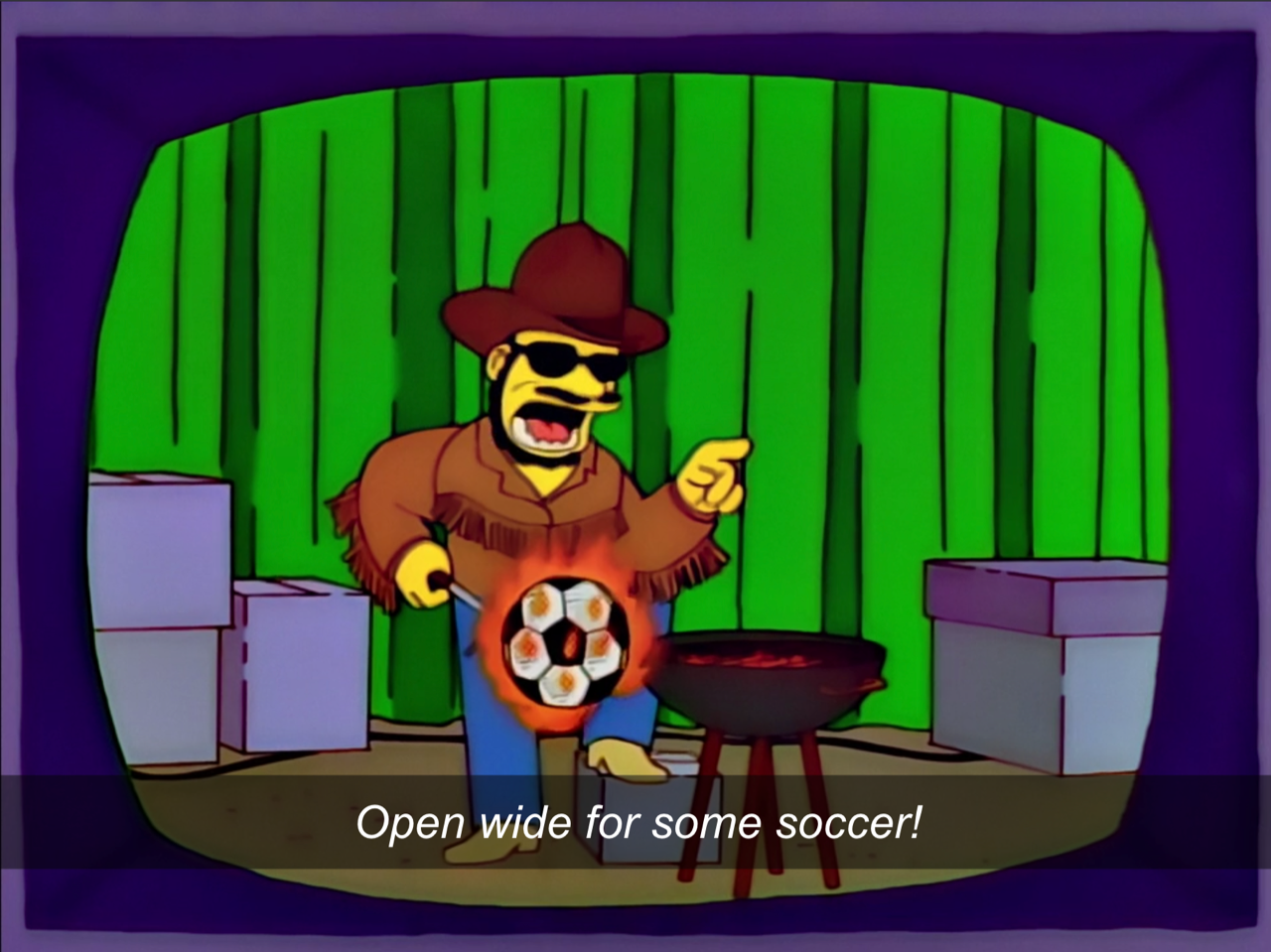
Look at this Vidal Sassoon model lookin’-ass trash. Why does the soccer ball look like the one I used in pee-wee soccer in the 1980s? Why is the ear so low on the head? Why does it look like he’s just failing at a basic header? Your nickname is The Cherries and this is the best you could come up with? Get the fuck out of here. The absolute worst crest in the Championship, and possibly all of English football.
![]()
Blackpoool
Jesus Christ, Blackpool, pump the brakes. You’re not the queen of England. This does actually look like a real family crest, however (Barnsley, are you paying attention?). Also, Blackpool sounds like a really depressing place to live.
“Where are you from?”
“Blackpool.”
“Oh. Oh, jeez. Sorry.”
Bristol City
Way to put in approximately 1% effort, Bristol. Maybe allocate more than 6 pounds or Euros or whatever to marketing. You aimed for “modern” and landed on “clip art.”
Cardiff City
Cardiff has always worn blue. They’re called the Bluebirds. When their Malaysian owners took over, they changed the color of the team to red (lucky in Asia), which pissed off pretty much everyone in the world not named Vincent Tan. Anyway, they tacked on an ugly out-of-place red dragon (to symbolize Wales and definitely not Asia!) and changed the color back to blue, since, y’know, they’re the BLUEbirds.
![]()
Coventry City
Okay, I actually really like this one. It’s got a castle, fancy ribbons, an elephant from the back of the Great A’Tuin, one bird holding the soccer ball while the other bird dies in a fire like a colonial American witch… it’s cool. And have you seen their away kits? Badass. Their home kits? Even badass-er.

Derby County
For the non-lesser-footy fans around here, the team is pronounced “Darby” because the English love to say words incorrectly. I feel like they tried to make the ram super serious…
…and it wound up just looking really confused and annoyed that you’re talking to its girlfriend.
Fulham
I’ve made my Mighty Whites fandom known around these parts (NAWT RACIST), but I’m not gonna be a homer here: the crest is trash. Some of their old crests were awesome: there was a ship, a knight’s helmet, swords, everything! They tried to modernize and took it too far, so now it’s just bland year-1 design student stuff and I’m not proud of it. Of course, we’re talking about a team that wore “VISIT FLORIDA” emblazoned on their shirts a couple of years ago, so expectations aren’t high. At least it doesn’t have Michael Jackson on it. Sigh.
Maybe it should have Michael Jackson on it?
Nah. Anyway, fuck QPR.
![]()
Huddersfield
As the owner of a pug/shih-tzu mix, I’m pretty much always going to be on board with a cutesy puppy holding a volleyball. While it’s cool they have a town landmark (the Victoria Tower) in the crest, uh… can we maybe find someone who can actually draw to redesign that part?
![]()
Hull City
Did you know they’re the Tigers? ‘Cause they’re the Tigers. There’s a tiger right there on the crest, in case you forgot. RAWR. That has got to be the least-threatening tiger ever. That tiger looks like it just “accidentally” said something racist. That tiger looks like it sits around and watches Fox News all day. That tiger looks like it failed P.E.

Luton Town
My my, Luton Town. Aren’t you a fancy lad? What a dapper hat! Plus bees and flowers? We’re all just terrified of your lil’ football squad, aren’t we? Yes we are! Yes! We! Are! Here’s a shiny nickel!

Middlesbrough
A rampant lion? Be more British, Middlesbrough. That crest is like 7 shades of red. Pick one and stick with it, you dinks.
![]()
Millwall
He’s an angry lion. Must be a South Pole lion.
![]()
Nottingham Forest
You’re Nottingham FOREST and you wear… RED? Seriously? Nottingham Forest, whose most well-known historical (?) figure Robin Hood famously wore green red. When they picked red, according to Wikipedia: “At this time, clubs identified themselves more by their headgear than their shirts and a dozen red caps with tassels were duly purchased.” I’m sorry, what? Caps with tassels? Were you trying to get into a fancy-off with Luton? Anyway, that crest looks like something a shipping company would reject.

Peterborough United
Heh, “peter.”
Those griffins are sassy as hell and do not want to share that shield. The team is nicknamed “The Posh,” so those fancy-ass griffins are appropriate, I guess. Their Wikipedia page lists about 7 different teams as rivals, because one thing everyone can agree upon is if you call yourselves The Posh, you deserve our scorn.

Preston North End
Are there, like, a lot of churches in Preston?* As we all know, a lamb laying down and praying is just soooo intimidating. Ten bucks says that lamb ain’t vaccinated and “trusts his immune system” over a mask (ahem, paging Rod and Todd).
*A perfunctory Wikipedia search reveals that there appear to be a lot of churches in Preston. I’m still gonna make fun of them.

Queens Park Rangers
Man, fuck these guys (see: I’m a Fulham fan). Nice illegible initials, assholes. They actually had a pretty cool crest for about 5 minutes until they decided “Nah, we suck” and went back to the stupid version. I’m not mad.
Reading
Pronounced “Redding” (well done on the pronunciation, England). Are they aware soccer balls have been redesigned since 1871? You will be shocked to learn that an English team has a lion and a crown on their crest.
![]()
Sheffield United
Swords are cool. Scimitars might be even cooler. Calling yourself “The Blades” is super cool. This is a good crest.
Stoke City
Looks like they caught Fulham’s “modernize it into mediocrity” disease. It’s way too simple and boring. This looks like a 4:30-on-a-Friday job. Also, “THE POTTERS”? Come on, you nerds.
![]()
Swansea City
On one hand, if you’re Swansea and you call yourselves The Swans, you kind of have to have a swan for your logo. On the other hand, you’ve pretty much abandoned any claims of creativity when you just say “fuck it” and don’t even try to come up with something better. Yes, I am aware that I am a fan of the Houston Texans.

West Bromwich Albion
Pronounced “West Brommich” because England, pronunciation, etc. (see: Derby and Reading). That’s a happy-ass bird for a team that just got relegated. When I wrote this, I was just salty because they were sitting above Fulham in the league table, but not anymore, bitches! Get in the backseat where you belong!


Leave a Reply
You must be logged in to post a comment.