![[DOOR FLIES OPEN]](https://doorfliesopen.com/wp-content/uploads/2015/08/DFO-MC-Patch.png)
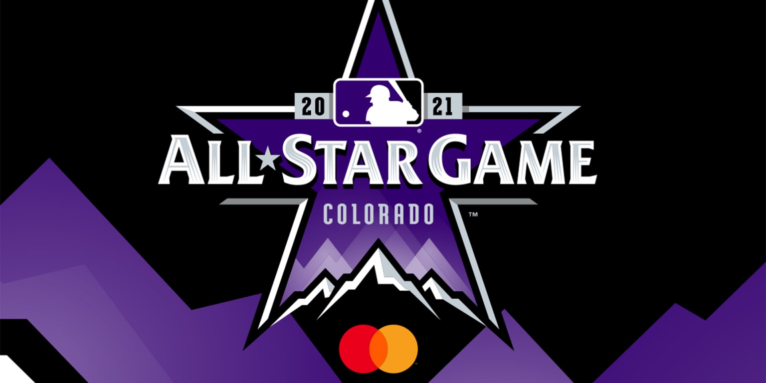
Yes, I’m sure that by the time this posts it’ll be old news, but they dropped the uniforms for this year’s All-Star Game (originally in Atlanta but moved to Denver because Georgia doesn’t want to let those people vote, and by those people we mean people who normally vote Democratic because we live in a country with two relevant parties and a first-past-the-pole system).
First off, take a look at the caps. Which are less egregious.
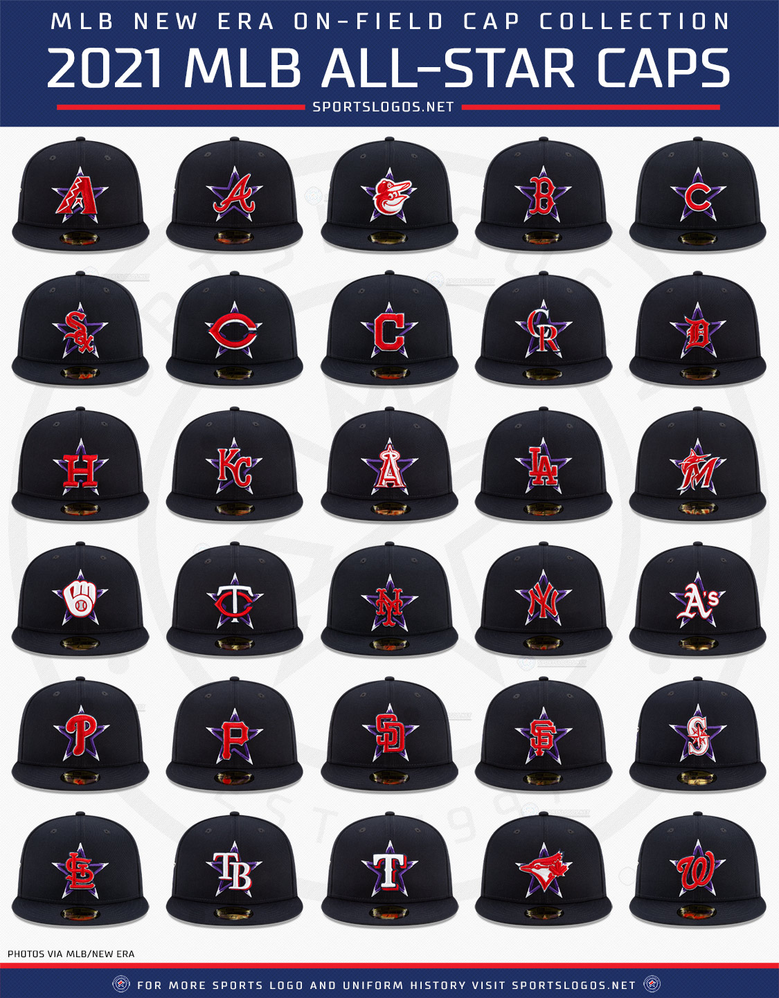
Like, these make sense, sort of. The purple star on the dark cap at least. No idea why the red logos. Last I checked, red was not in the Rockies’ color palette. Black caps, yes. Purple star, yes. Red logo, not so much. Is Yankees Facebook blowing up because “how dare they make the interlocking NY red”? Yeah, of course it is. I agree in the “why red,” but again, that’s because what color scheme are we going for here anyway? Why is red in this at all? If they had made white stars with purple, that would have probably looked pretty nice. I like purple in some cases and think it is an underutilized color. I like the Rockies’ color palette and miss their pinstriped vest unis. (This is only slightly influenced by my high school’s colors being purple, gold, and black.)
But that’s not what we’re here for.
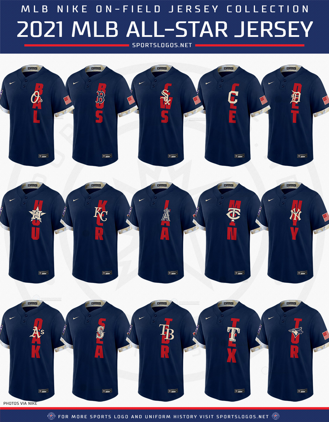
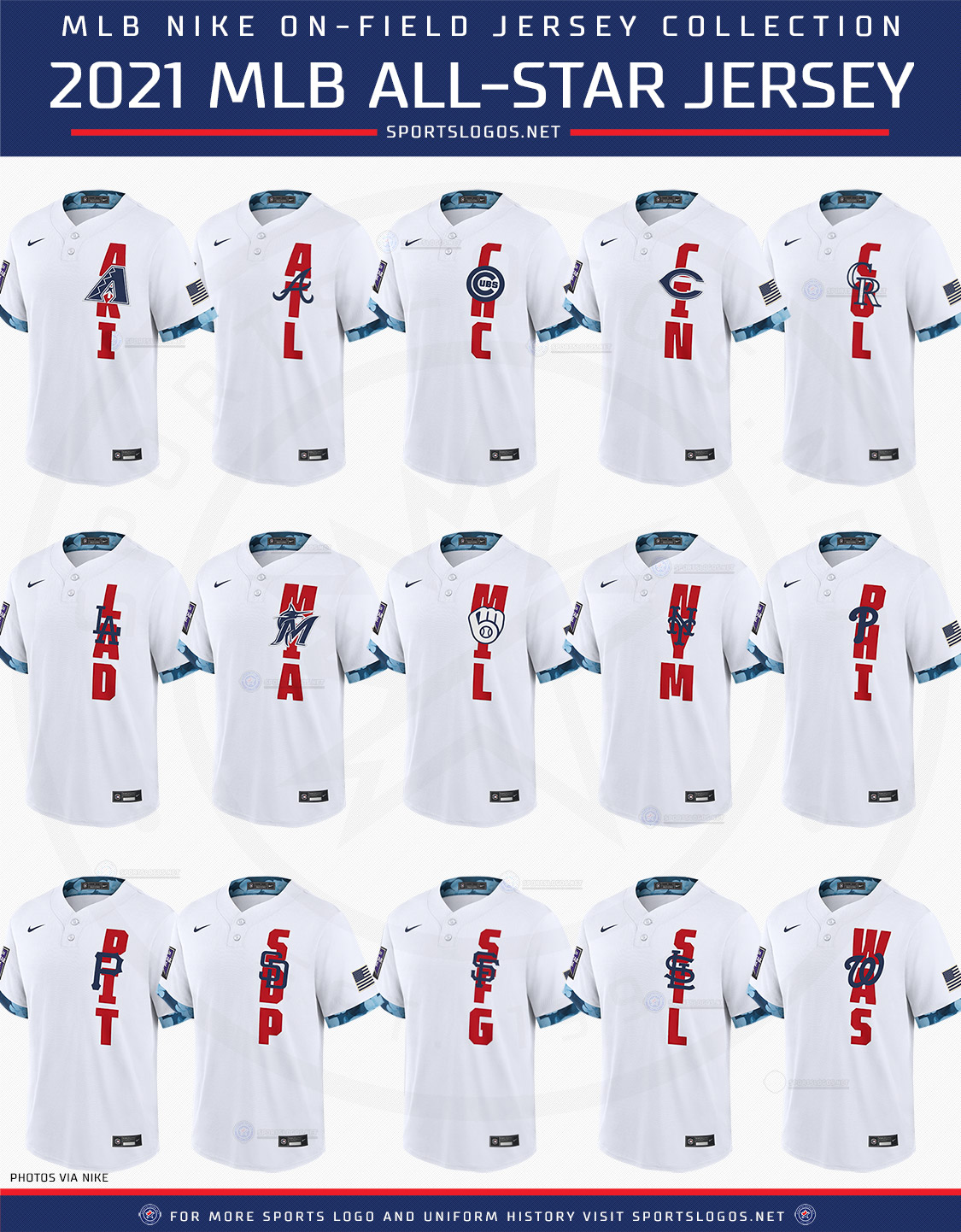
Okay, where do we begin. I mean, where can’t we begin? First off, the design: they’re not the full button-downs you normally see from game unis. They’re two-button pullovers that you see in warm-ups.
Next up, the camo, I guess?
There’s little camo bits on the ends of the sleeves, and the inside collar. I have no idea why. Don’t ask me why. I’m pretty sure don’t ask anybody why. Just like don’t ask anybody why the American flags are AL/NL tinted. Which I’m like 99% sure is a flag code violation for altering the flag. Also, the Blue Jays have an American flag, because fuck it, Buffalo Blue Jays. I’m sure Canada is not slightly miffed with that, although watch, the Canadian flag would have been color inverted or something.
Also, if we’re in Colorado, why is this blue vs. white, and not black vs. purple? Again, color scheme matching here. Not that difficult.
Next up: the lettering. I have a host of questions with this. One, why? Are we all going for the Falcons’ “ATL” on all jerseys now, but this time, let’s make it vertical? Also, when have the Royals gone by KCR, the Rays by TBR, the Giants by SFG, or the Padres by SDP? On the MLB site I mean. Let’s check Gameday.
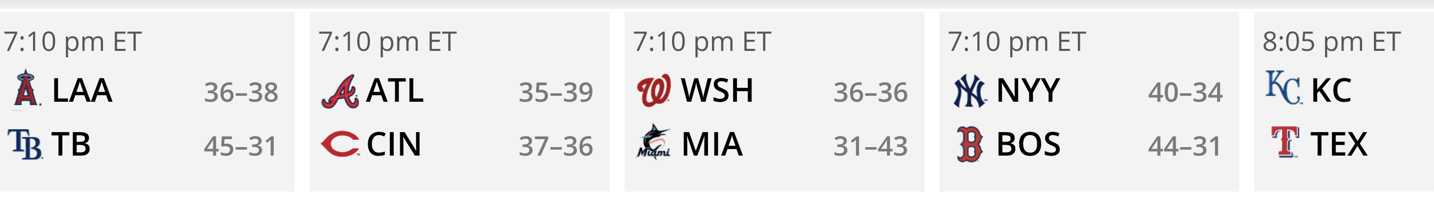
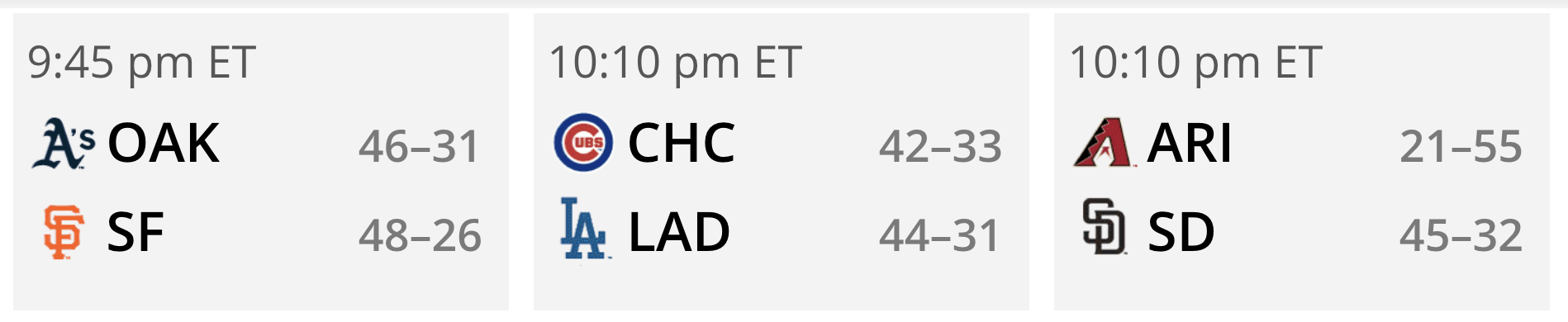
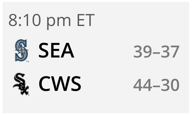
Extra question: it seems like every other year the White Sox change from CHW to CWS and/or vice-versa. Which one is it?
Holy shit. I got it. These were the original plans for All-Star Game unis, and there was enough time to alter the caps when the game got moved to Denver, but not enough time to change the actual uniforms. Which is why the whole thing is a mish-mosh. There wasn’t enough to change the entire concept of the 2021 All-Star Game uniforms, but only enough time to change the caps. And even that was just to alter it to Rockies colors instead of Braves colors. There wasn’t enough time to do it with the jerseys.
Which I guess wouldn’t be a problem, if this wasn’t also the first time ever that these unis wouldn’t just be worn during the work-out day/Home Run Derby, but the actual game itself. Now as far as traditions go, I understand why this would be one to break, while at the same time most people actually like the All-Stars wearing their actual uniforms. But the combination of these looking like complete ass with them being the first ones ever to be in-game All-Star unis has MLB land even more pissed off than usual. Which is saying something because everyone’s still miffed that checking for illegal substances has turned into burlesque. (Personally I think that it’s a little bit hilarious. Also really dumb to do midseason and set an arbitrary date when they should have been checking these things the whole time.)
Anyway, whoever came up with this deserves to be laughed at. Because their uniforms are bad and they should feel bad. That is all.

Leave a Reply
You must be logged in to post a comment.