![[DOOR FLIES OPEN]](https://doorfliesopen.com/wp-content/uploads/2015/08/DFO-MC-Patch.png)
On Monday the NBA unveiled the “City Edition” r-r-r-remix versions of all their teams’ jerseys. Some are good, some are bad, some are stupid. But because this is DFO, we will consider all of them terrible at best. The hate will be inconsistently applied, as good things on one uniform will be considered bad on another.
Anyway, let’s get to the hatin’…
———————
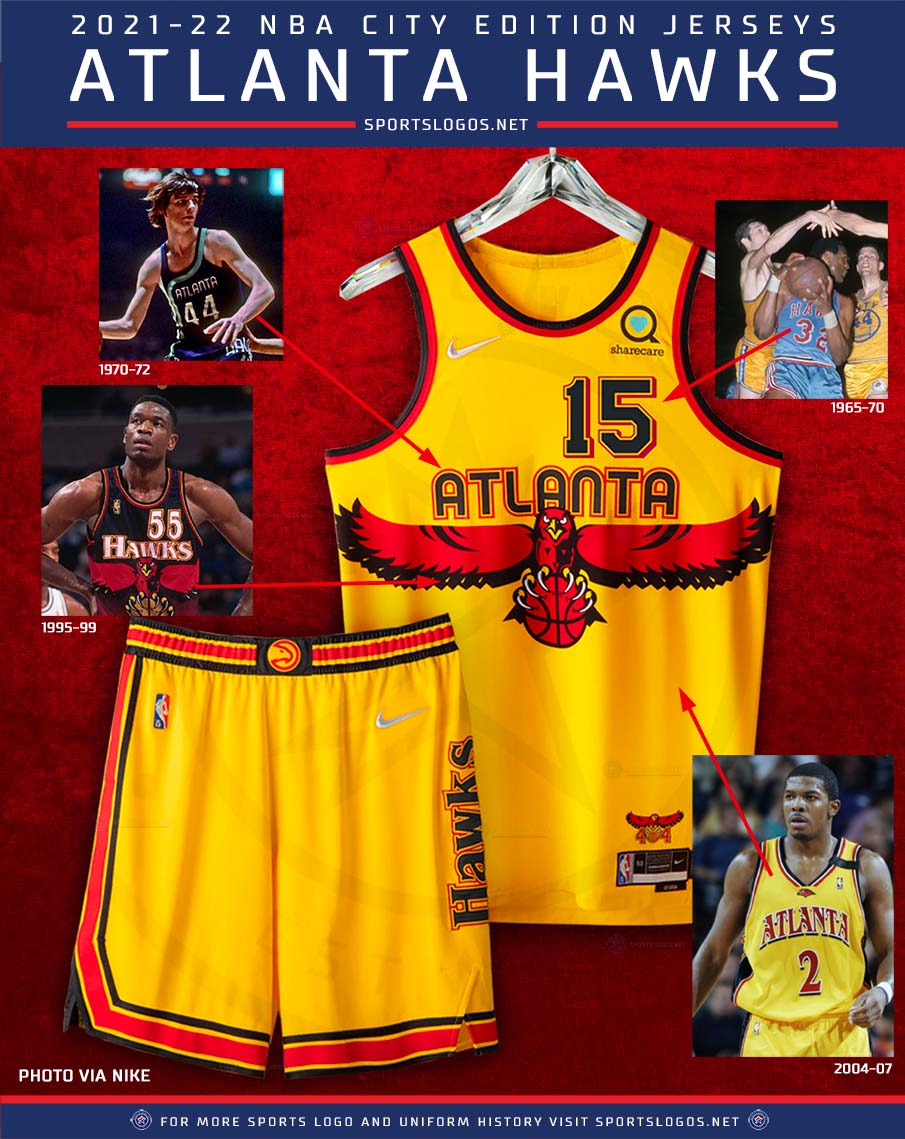
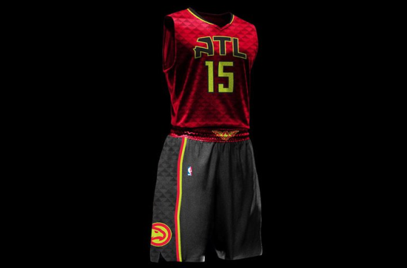
Atlanta Hawks
We kick things off with the Hawks, who have resurrected one of the worst 90s uniform trends (along with teal, EXTREME! graphics, and weird fits): slapping a gigantic cartoon logo smack dab in the middle of the jersey. Oh well. I guess it could be worse.
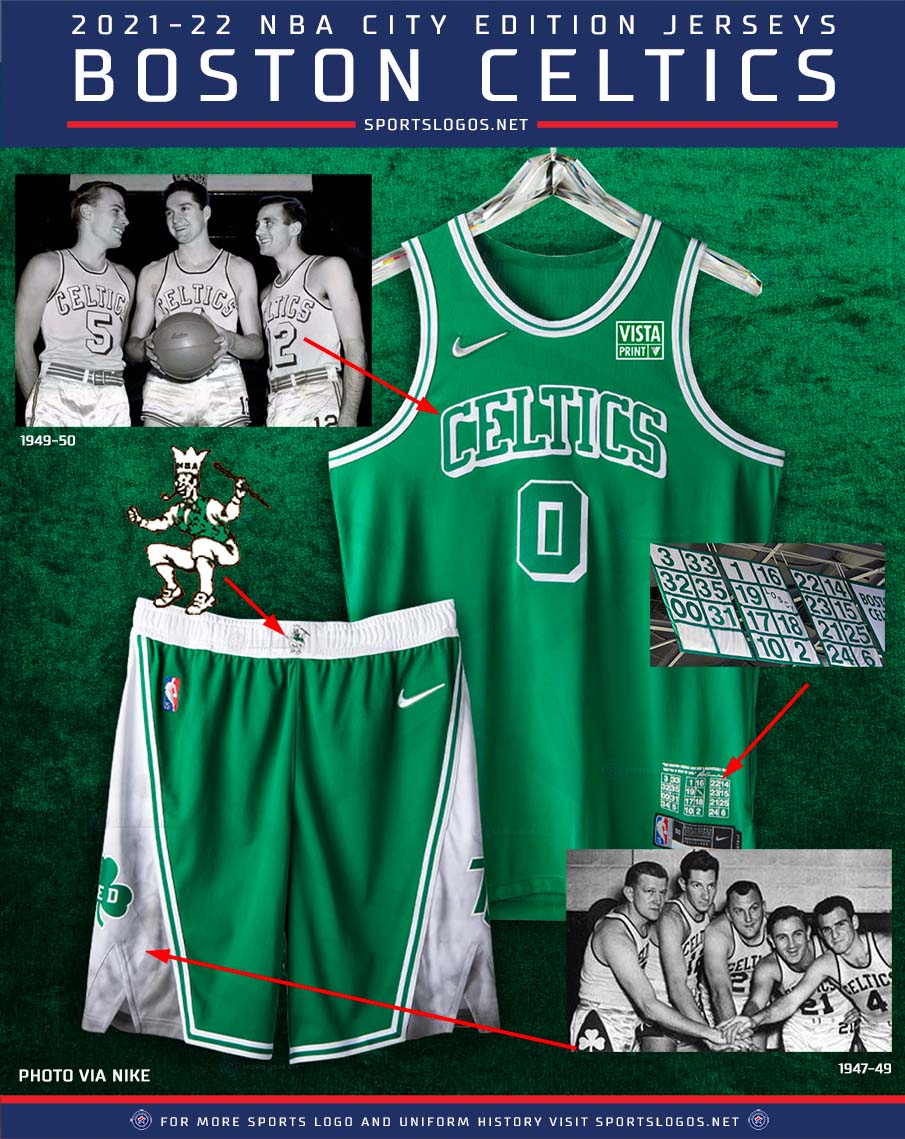
Boston Celtics
Just… why? The Celtics’ uniforms are boring as shit and that’s how they should stay. Also, we get it: you won a fuckload of championships back when our great-grandparents were virgins and black people weren’t allowed to play. Get over it, Boston. Tom Brady’s not coming back.

New York New Jersey Jay-Z Brooklyn Nets
Your team name is dumb. Almost everyone else went with a wild design and you decided to put us to sleep. That sponsor logo is awful. Get vaccinated, Kyrie.

Charlotte Hornets
Man, you almost had it, Charlotte. You almost walked away victorious with the hexagons, but you inexplicably shanked the game-winner by fading it to mismatched pinstripes. Just ruined the whole look. At least you didn’t put too much effort into reminding us that you were the Bobcats for five minutes.

Chicago Bulls
Damn. I’m really having a hard time coming up with something to hate about these. The sponsor patch is stupid. There. Are you happy?

Cleveland Cavaliers
This is kind of the first “we just threw all 90 of our past looks into one uniform and it wound up looking like shit” uniforms. Don’t worry, fellow DFOers: there’s more of this trash to come.

Dallas Mavericks
Remember when I said there was more “we just threw all 90 of our past looks etc. etc.” to come? Here it is. I don’t even care if these had been the best of the bunch: I’m from Houston, so fuck Dallas and everything about Dallas forever and ever and ever.

Denver Nuggets
I’m not gonna lie. These make me just a tad bit tumescent. Don’t get me wrong: they’re still fugly as hell. But I love all the random elements mixed together. I also happen to love mountains and played many hours of Tetris back in the day. That’s probably unrelated.

Detroit Pistons
When your historical looks are Boring, Boring, Boring, 90s Teal Abortion, Boring, Boring, it’s tough to make something exciting that teenagers will put on their Christmas lists. But you still failed, Detroit. What the fuck is with the lightning bolts? Did you merge with the Chargers and no one noticed?

Golden State Warriors
I can definitely see why you’d want a black uniform, since that’s one of your team’s col–oh wait, having a black uniform is stupid if it’s not your color. You’d be hard-pressed to find a Warriors fan who wants to remember the bad old days of the Thunder mascot. It’s interesting that they don’t reference the old Philadelphia Warriors, though. Hmm, wonder why.

Houston Rockets
Goddammit, Rockets. Why? What the everlasting fuck? The pajamas of the late 90s were NOT a good look. Why the hell are you reminding us of your cartoon rocket days? Why wouldn’t you just put yourselves in the classic ketchup n’ mustard look that you never, ever should have abandoned?

Indiana Pacers
This looks like some shit from the create-a-team feature on NBA 2K. Send it back.

LA Clippers
The Clippers have had some interesting, odd looks in the past, none of which bring to mind a multi-mast galleon capable of sailing the high seas. At least this is an improvement over their boring-ass current set?

LA Lakers
Look, you and I both know the Lakers should wear yellow and purple only. They own the color combo. There’s no reason to wear anything else. The stars on either side of the number look like nipples.

Memphis Grizzlies
When the Vancouver Grizzlies moved to Memphis in 2001, they got rid of the stupid 90s teal (I told you it was everywhere back then), but they also got rid of the crazy-ass details that made the uniforms a weird, wonderful relic of their era. Thankfully, this brings all that back. These are good. I mean, the entire concept is fucking ridiculous, but these are good.
Miami Heat
You know what? Let’s not do these yet. They’re so bad I’m gonna leave them to the end.

Milwaukee Bucks
I can’t see the Bucks without thinking about this tweet. These uniforms look like the designers smoked a bunch of angel dust and tried to do everything at once. Never should have ditched the weirdly sexy (?) original logo.

Minnesota Timberwolves
“Timberwolves” is one word. The actual animals are “timber wolves;” two words. I can’t unsee it and now you can’t either. Otherwise these are actually pretty awesome.
Timber. Wolves. Come on, Minnesota.

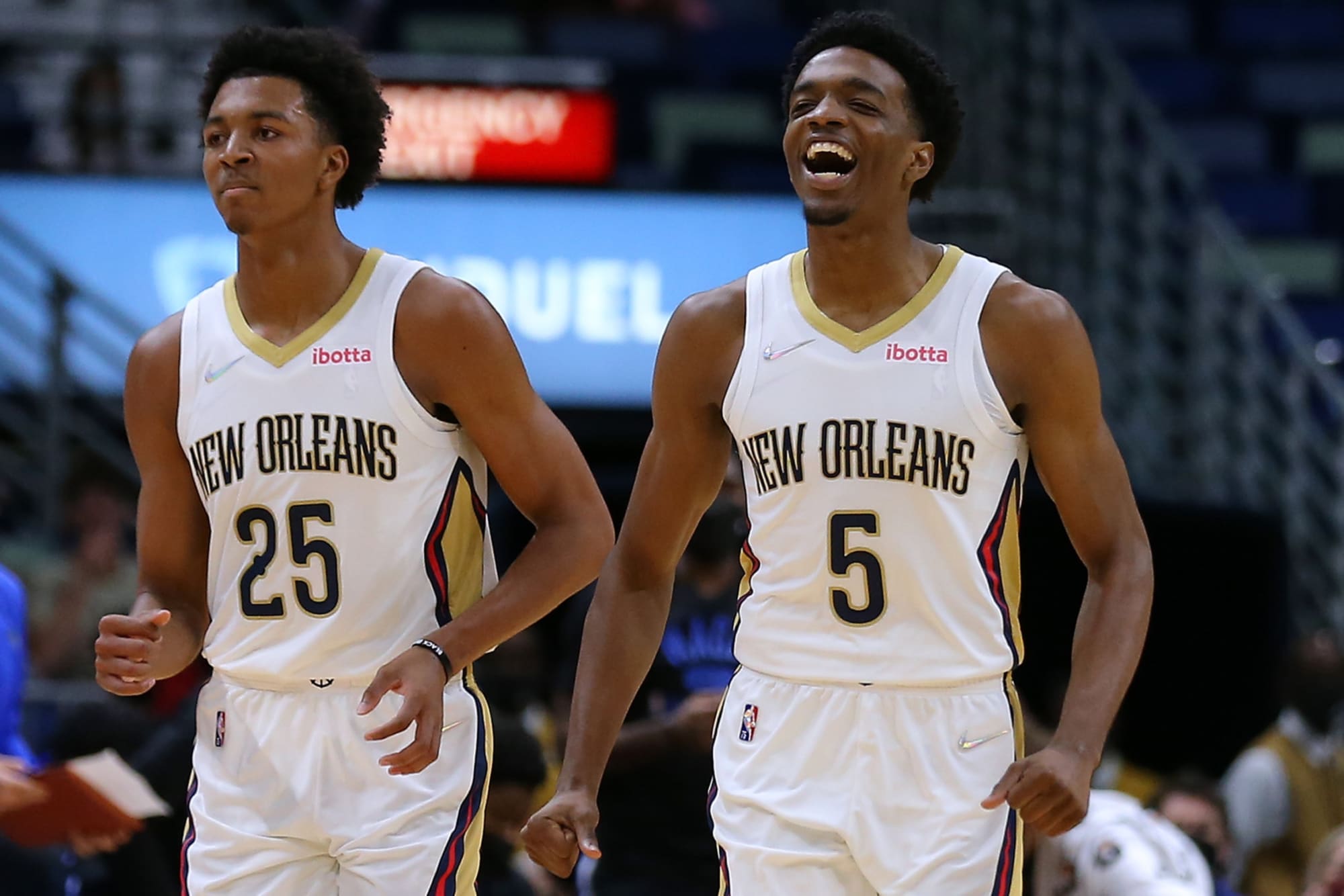
New Orleans Pelicans
Did we forget to call New Orleans when we were making these, Nike? It’s okay if you forgot New Orleans has a team. New Orleans often forgets that New Orleans has a team. These are their usual uniforms, by the way.

New York Knicks
You dipshits must have called Golden State and said, “Are you using black? Because we don’t want to do it if you don’t. But if you’re doing it, we’ll do it too.” No one outside of New York’s city limits gives two shits about Madison Square Garden.

Seattle Supersonics Oklahoma City Thunder
I kind of dig the all-white uniforms.
However:
You stole a team with an incredibly cool look from Seattle.
Absolutely nothing about your current uniforms or branding communicates the concept of “thunder.”
You’re in the same division as the Rockets and you’re in Oklahoma, so super-duper fuck you forever.
Basically any designer could come up with a better brand than you dipshits did.

Orlando Magic
The Magic incorporated orange as a nod to the orange industry in Florida. You know what else is grown in Florida? Limes, bananas, figs, meth-heads, racists, and persimmons. I don’t see any nods to those.
The stars on the sides are kind of cool, though.

Philadelphia 76ers
Ha! Gayyyy!
I’m kidding, I’m kidding. I love the gays! One of my best friends A guy I work with A woman I met one time Someone in the same aisle as me at the grocery store one time was gay!
Okay, all joking aside, these are pretty fucking sweet. I don’t love the “mashup” aspect, but the rainbow, the 76ers shorts logo, the team name on the jersey: all very good. Way to not fuck it up entirely, Philly.

Phoenix Suns
This was just Phoenix’s alternate uniform last year. A-plus design, but the lowest possible F-minus for effort. For a team with a pretty interesting visual history, this sucks out loud. No wonder you guys can’t win shit.

Portland Trailblazers
Does anyone outside of Portland call it “Rip City?” Hell, does anyone inside of Portland call it “Rip City?” This is boring and too close to their regular uniforms. Go drink some more kombucha, you fuckin’ weirdos.

Sacramento Kings
“Sactown?” Holy shit. At least “Rip City” is a cool name. I wouldn’t want to wear a jersey that reminds everyone our town’s nickname is scrotum-related. It’s bothering me way too much that the purple stripe on the shorts doesn’t continue up the side of the jersey. Also: no one has ever been “Sacramento Proud.” It’s a good thing that part will always be tucked into the shorts… right by the player’s “sactown.”

San Antonio Spurs
Oooooohhhh so close. San Antonio. You used the fiesta colors to great effect… except since the uniforms are white, you look like the Flint Tropics. Swing and a miss.

Toronto Raptors
Yet another team that had a gigantic cartoon logo on the front of their jerseys in the 90s and decided to bring that back for some reason. Just buy the team already, Drake. Your music sucks.

Utah Jazz
Just like the Suns, the Jazz decided to say “fuck it” and recycle an old design instead of putting in a minimum of effort and doing something new. Is there something in the water over there? Anyway, also like the Suns, you losers can’t win shit.

Washington Wizards
Look, I get your mayor was a crackhead and people were getting shot all the time so you couldn’t be the Bullets anymore, but “Wizards” is, always has been, and always will be an incredibly dumb name for a basketball team. At least the uniforms are good and you quit wearing 90s abortion teal. Change your name.

Miami Heat
What
The
Fuck
Saving the best (worst) for last here because holy shit, these are awful. Who decided “ransom note” was a good font? Fun fact: there are 7 different fonts for the numbers, and players will be able to choose the individual font for each number on their jerseys. That way they can all look like they play for different teams!
Please, please, please fire everyone involved with this concept. This is so fucking ridiculous. What a gigantic pile of shit. What an abject failure. Miami’s uniforms are normally awesome. This is the exact fucking opposite.
I’m gonna go watch some football.
(All pics courtesy of sportslogos.net. You can find the entire entry here.)


Leave a Reply
You must be logged in to post a comment.